Product screens
The app, in detail.
A look at the shipped iOS interface for the Looking Glass Go companion app.
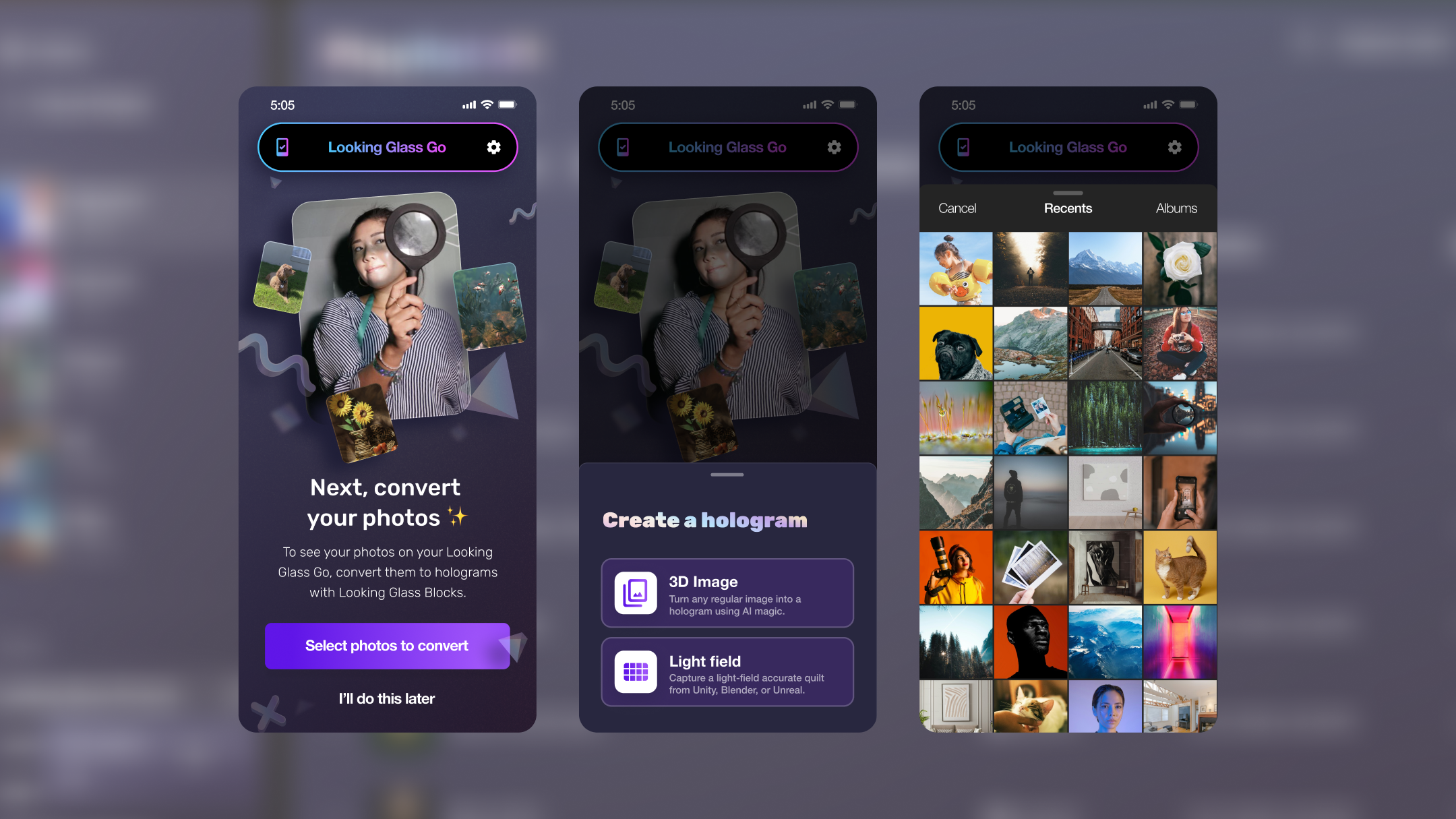
The Looking Glass Go is a holographic display that sits on your desk. My job was to design the mobile companion app that connects a phone camera to a 3D lenticular screen. There was no existing playbook for this.
This wasn't a standard mobile app. Every design decision had to account for four things at once: hardware, network, AI processing, and a completely unfamiliar output format.
The display connects over local Wi-Fi, not Bluetooth, not USB. The app had to make an invisible connection feel reliable. Any latency in the setup flow would read as broken hardware.
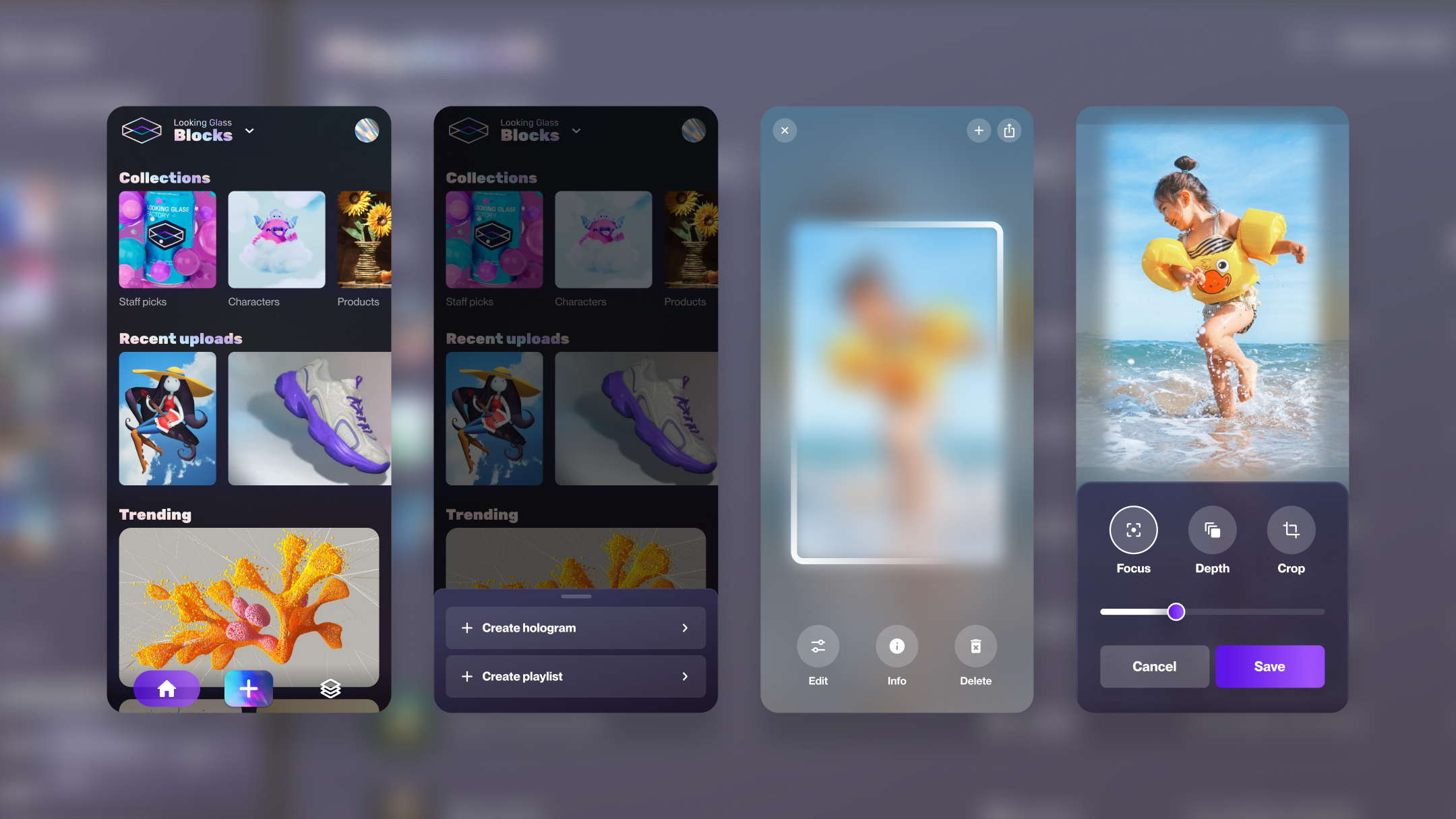
Converting a 2D photo into a 3D holographic depth map requires cloud inference. That takes 3–8 seconds. The design had to make that wait feel productive, not frustrating.
Users had never seen their photos as holograms before. The first "wow" moment was also the moment they needed to understand how to control the display. That's an unusual onboarding problem.
The device had multiple distinct states (searching, connecting, syncing, firmware updating, ready), each requiring its own design treatment. One vague "loading" state would kill trust.
The biggest design decision was how to handle 3–8 seconds of cloud AI processing. We tried two very different approaches, and only one actually built trust.
A spinner with "Processing your photo…" — no progress indication, no preview of what's being created.
A progress indicator with a real-time 2D depth preview — showing the AI's work before the hologram renders on the display.
Hardware products punish vague loading states. I defined four explicit device states, each with distinct visual treatment and clear user guidance.
Animated Wi-Fi scan with device illustration. Step-by-step guidance visible — not hidden behind a loading indicator.
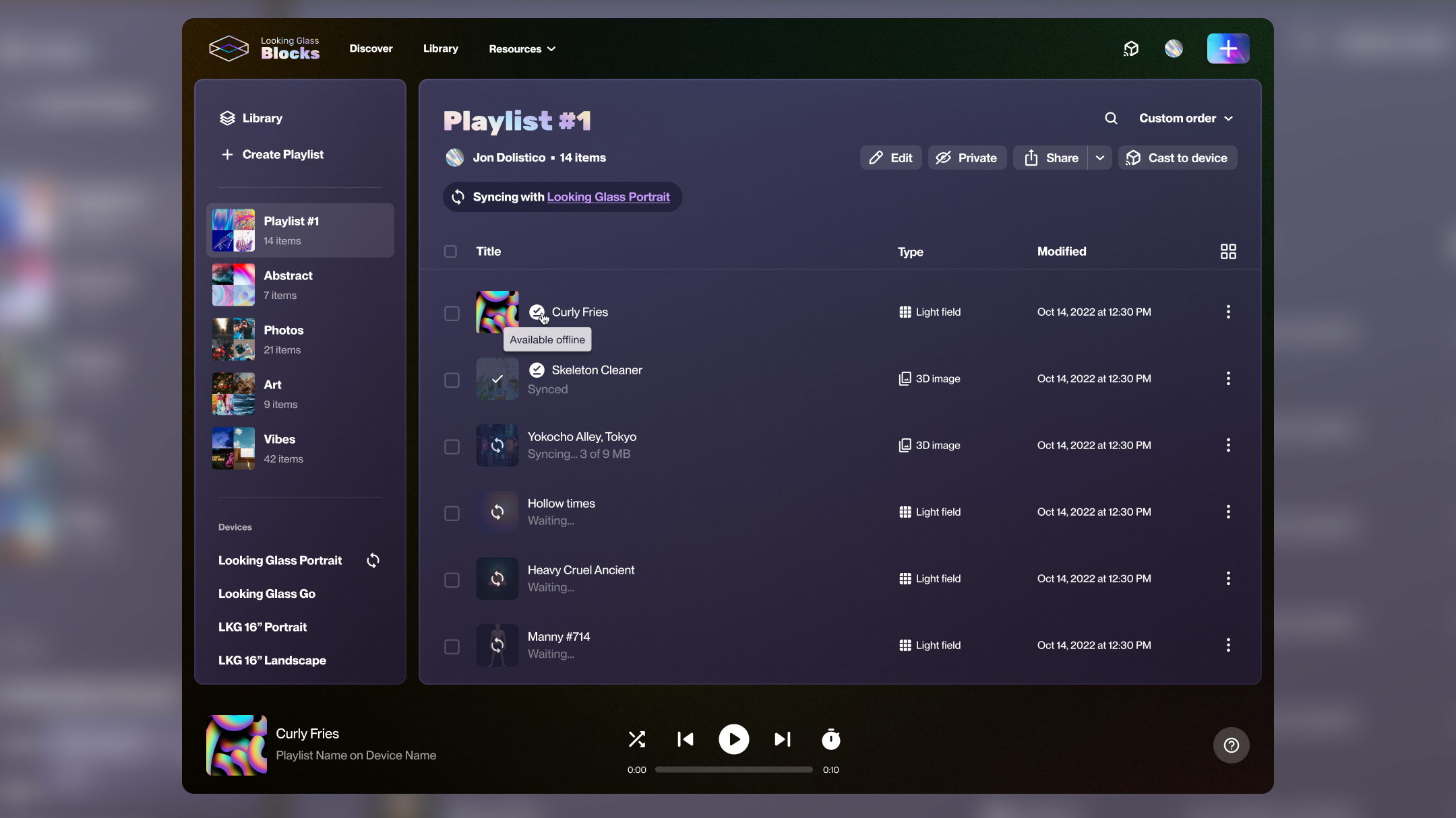
Setup flowProgress bar with file count. Users know exactly how long and why: content is being transferred to the display's local storage.
ActiveFull-screen interrupt with critical messaging: don't unplug the display. High-stakes state treated with appropriate visual weight.
CriticalClean confirmation with display preview. Transition into the main experience is intentional — celebrate the connection, then get out of the way.
CompleteA look at the shipped iOS interface for the Looking Glass Go companion app.
Naming every hardware state explicitly and designing each one deliberately. Hardware users are already anxious — specificity calms them.
I'd involve hardware engineers earlier on the state machine definition. Some states I designed for were never reachable in practice; others I missed entirely showed up in QA.
The "wow" moment wasn't the hologram — it was the depth preview during AI processing. Users were more engaged watching their photo get parsed than watching it render on the display.
Designing for physical hardware teaches you that the app is only half the product. The connection experience, the power cable, the physical placement — it all shapes the UX.